So here we are. It’s early 2016, and we’ve just put a massive 2015 behind us. We’re here, standing tall against our competition, with a product that’s ready to break out of the gates.
We have a number of big initiatives this year, but it’s one of the smallest ones that makes me most giddy:
Eye Candy.
Or, actionable and relevant data. Depending how you look at it.
But since I’m officially 50% data/tech nerd and 50% design enthusiast at this point, I’m pumped up about it from either perspective.

Info Page Overhaul
If you’re a client, or have done a demo with us, you know about our super simple three-page-design pattern. Learn three screens, and you’ve learned 80% of PushPress.
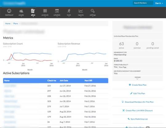
One of those screens is our Information Page. This will show you key information about any “thing” in our system. The scree above shows our new information page for a plan.
In the coming weeks and months, we’ll be revamping the info pages one by one to give you a bad-ass in-depth view into what’s going on with that thing.
For Plans, as seen above, we’ve started off by showing you a clean graph of active subscription count, count change (+/-) and revenue in a historical month by month snapshot. (All revenue data is ADMIN ONLY - coaches will not see it)

Making You A Better Owner
Hands down, our goal is to make you a better owner, and thus a more successful business.
If you don’t know your data, you’re handcuffed.
But worse yet, if you are given too much data to weed thru, you’re left with a false sense of security that you know what’s going on when you probably don’t.
Our direction is simple: SIMPLE.
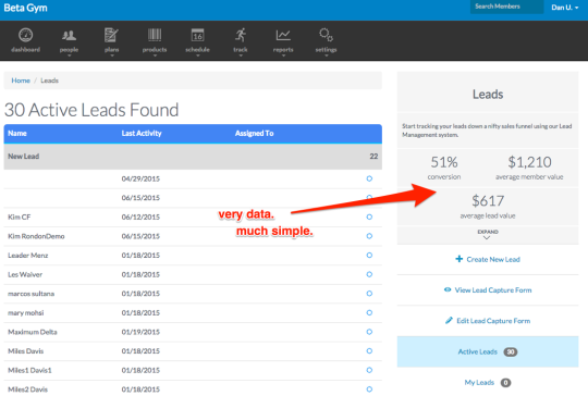
Less reports. More important data, placed in places that make sense and allow you to utilize the data in the flow of the page you’re staring at.
IF THIS CONCEPT RESONATES WITH YOU - YOU ARE THE PUSHPRESS.COM KIND OF OWNER.


