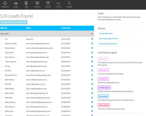
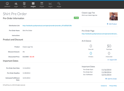
Over the coming days and weeks we will be shifting existing sections to a more streamlined interface. We take a lot of pride in the look, feel, aesthetic, and overall functionality of our systems, and constantly are looking to make things better.
As we move towards this, we will be shifting to the concept that all key actions should take place on the right rail of the page. So start looking there for things to do once you see a page get a facelift!
Here’s a screen shot of the new layout. You can see the right rail is now providing much more functionality (and it looks pretty damn good too!)

As pages contain more complexity, this right rail will provide faster and easier interaction. It will also give us a chance to boldly bubble up some key information about the screen you’re currently on.

In the meantime, we apologize for some pages with mis-matching styles. We’re going to be moving over to the new interface a little at a time, since we’re going to be thinking of how to best use that rail in each section.


